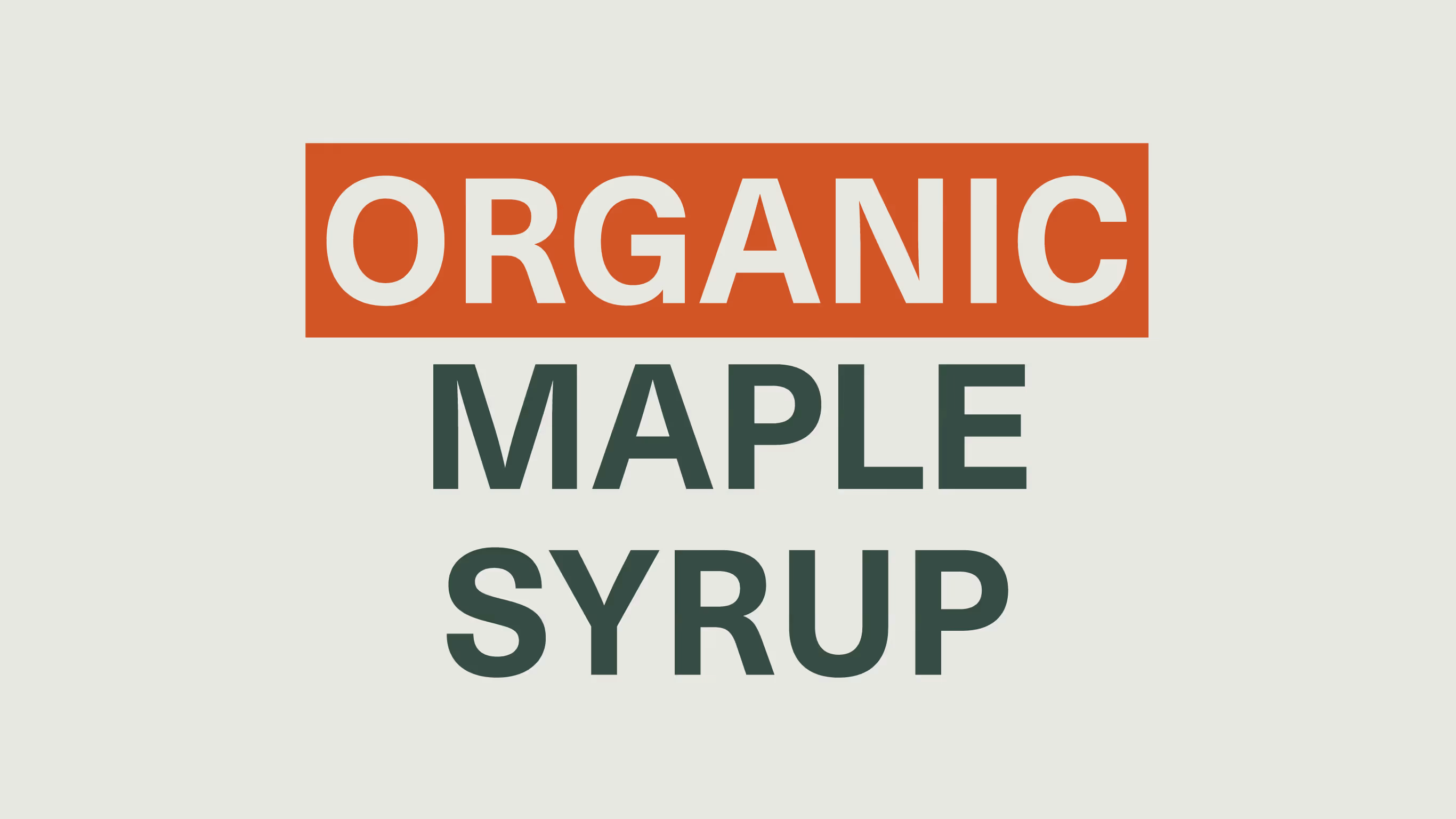
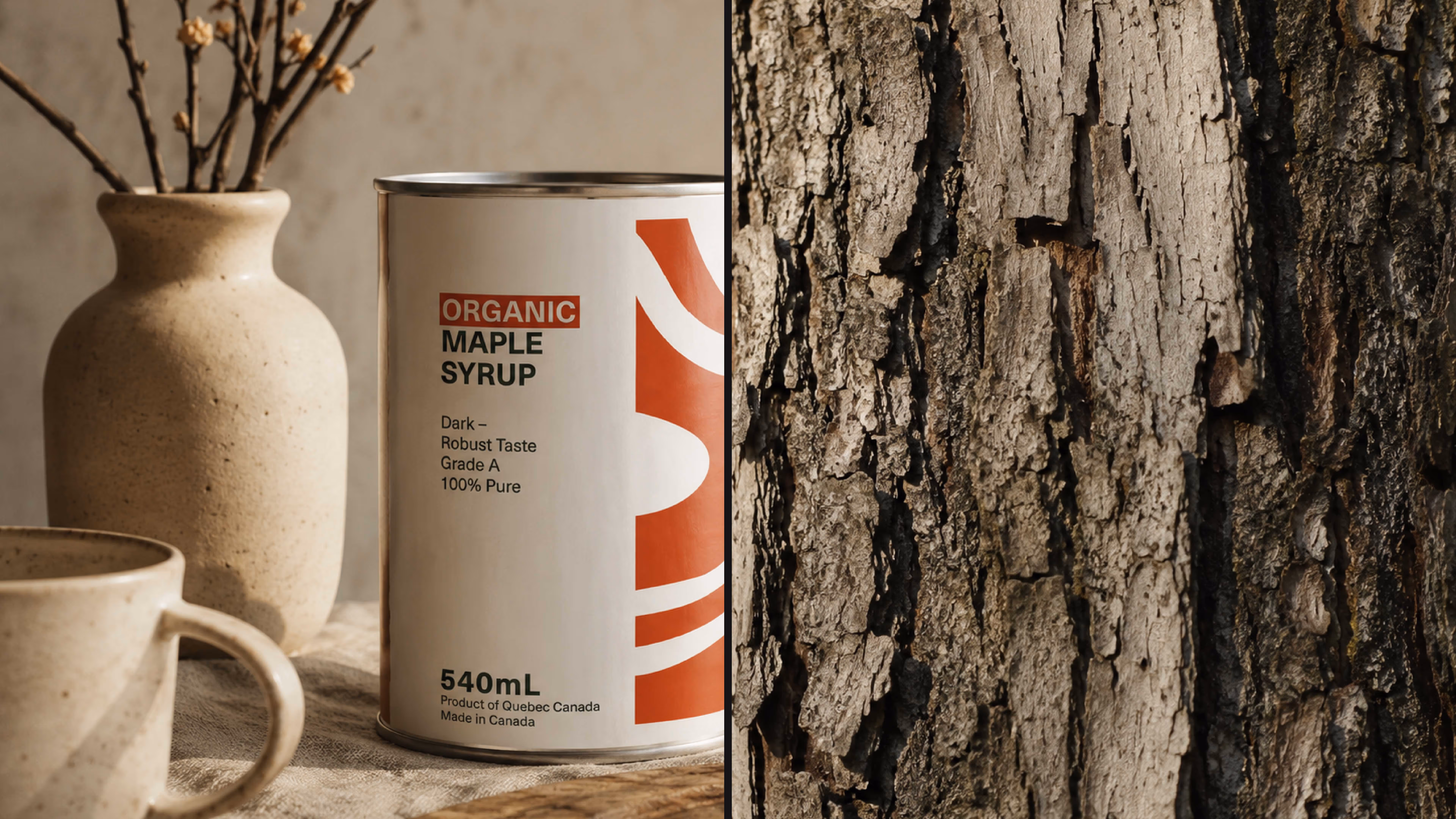
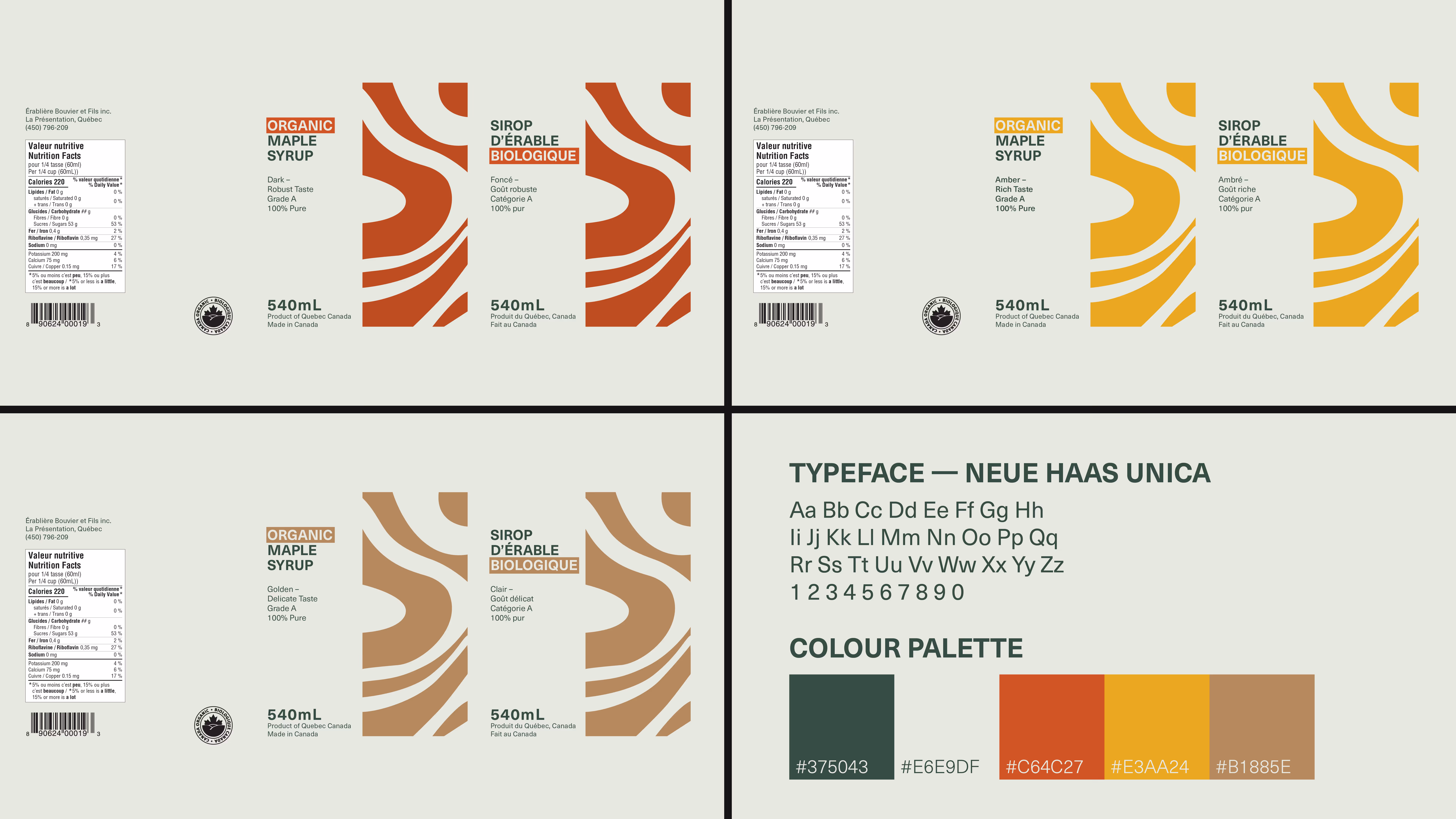
The objective was to redesign the traditional Québec maple syrup tin in a way that highlights its organic qualities while preserving the heritage people expect. The design needed to support the official grading system while appealing to both local consumers and international buyers looking for an authentic Canadian product.
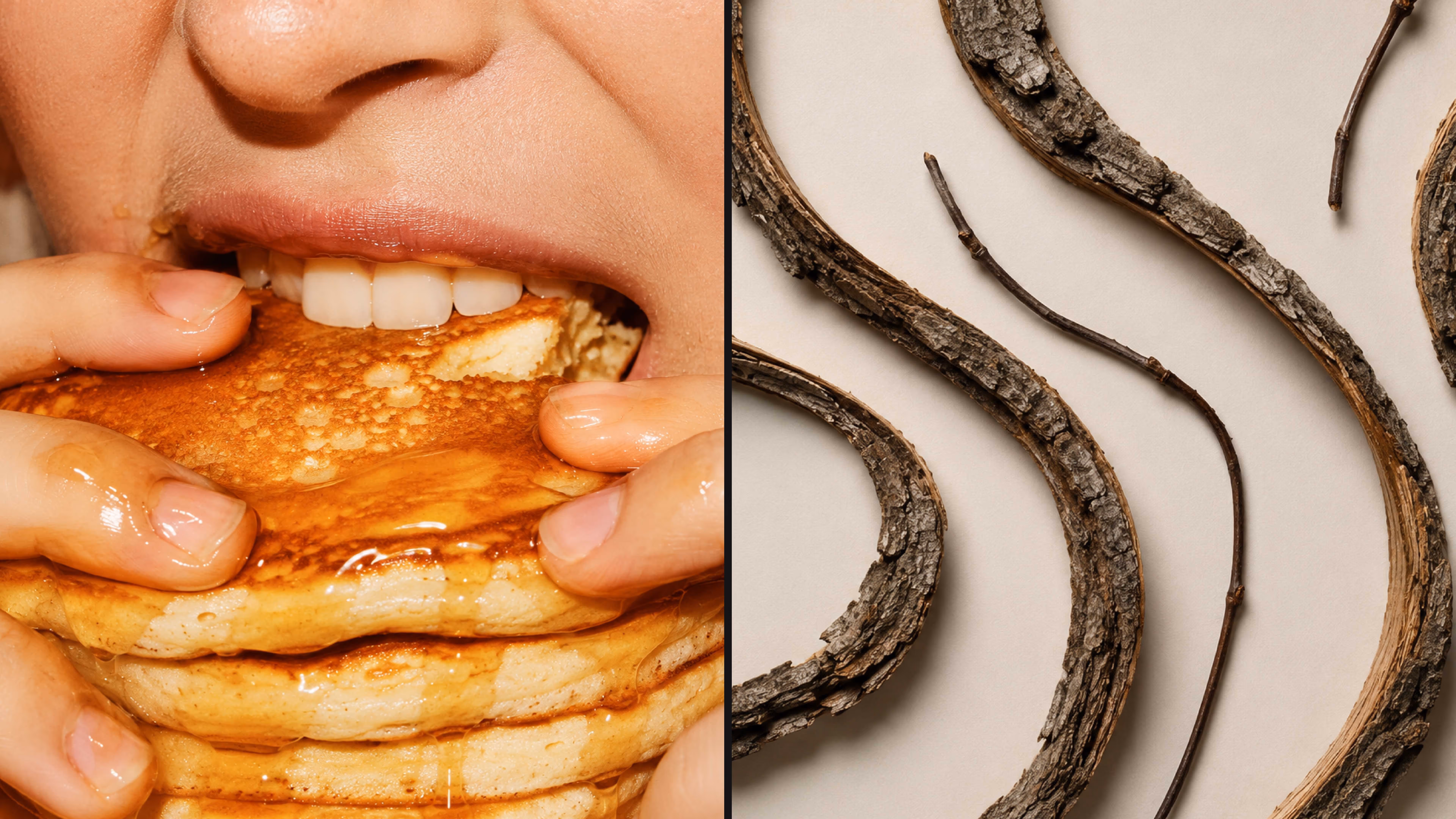
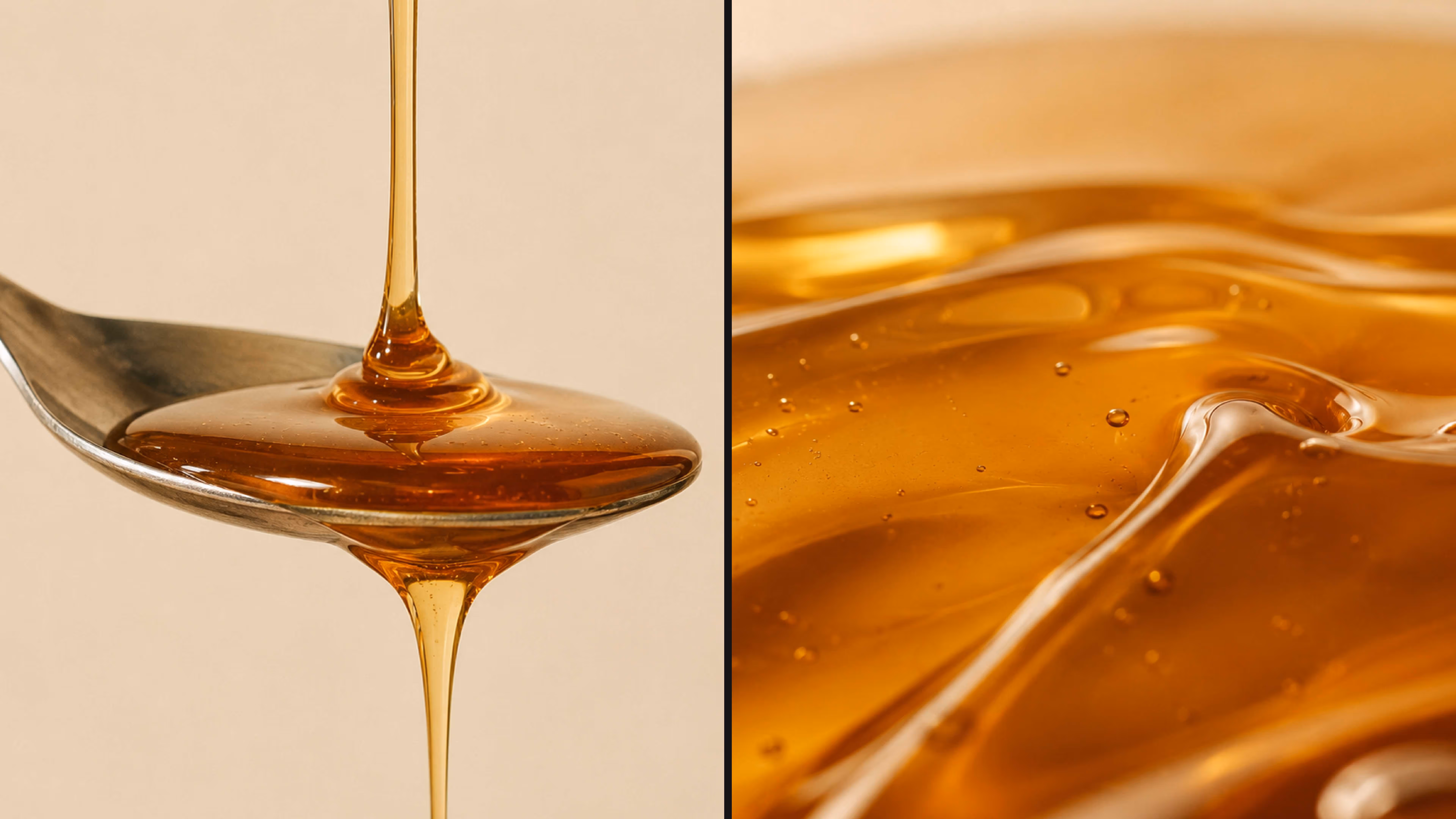
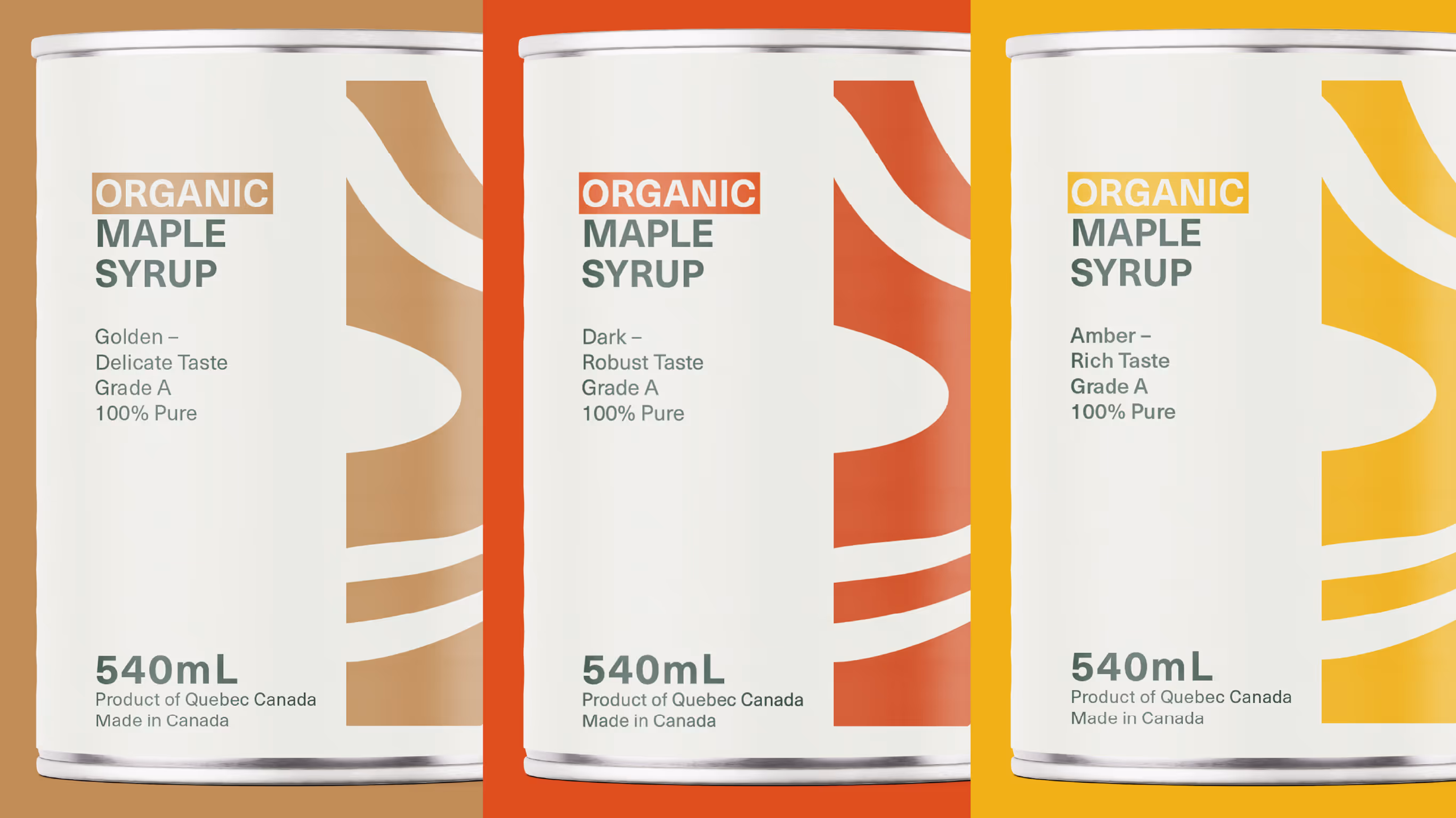
The approach focused on simplifying the visual language while keeping a strong connection to nature. Instead of the detailed farm scenes often found on syrup packaging, the design uses bold abstract curves inspired by tree bark and the flow of dripping syrup. The graphic system is paired with restrained typography and a structured layout to improve clarity across both English and French labels.
The result is a modern interpretation of the classic maple syrup tin. Clean, minimal, and distinctive on the shelf. The design maintains its connection to Québec tradition while presenting the product in a more contemporary and premium way.