Beam is a courier service focused on fast and reliable deliveries. The goal was to design a clear and recognizable logotype that reflects speed, efficiency, and trust.
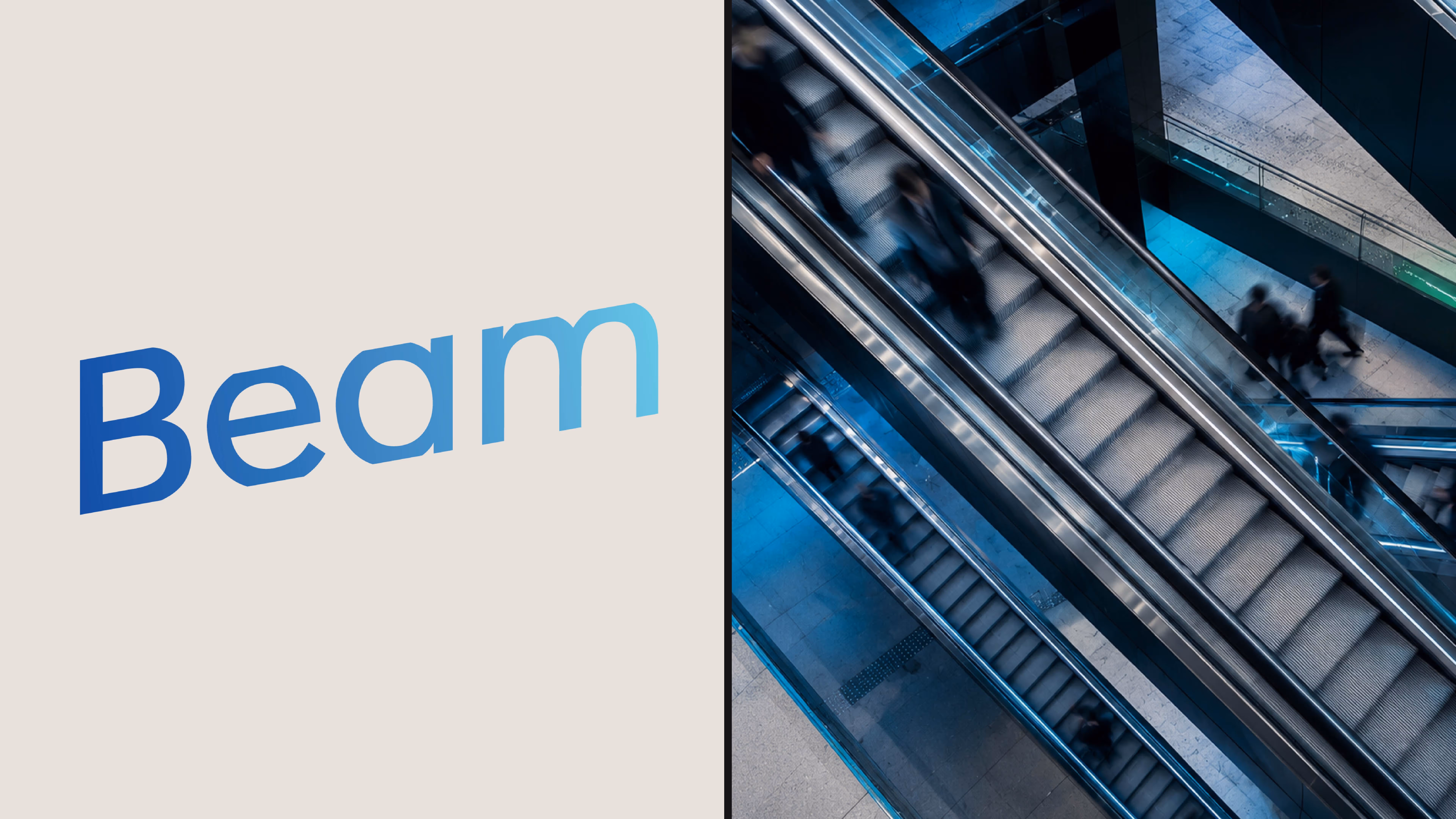
The name Beam naturally suggested ideas of light and movement. The wordmark leans forward to create a subtle sense of motion, hinting at packages moving quickly from one place to another. The typeface was chosen for its clean and modern feel, then modified by trimming the top and bottom of the letters to create a sharper, more distinctive look.
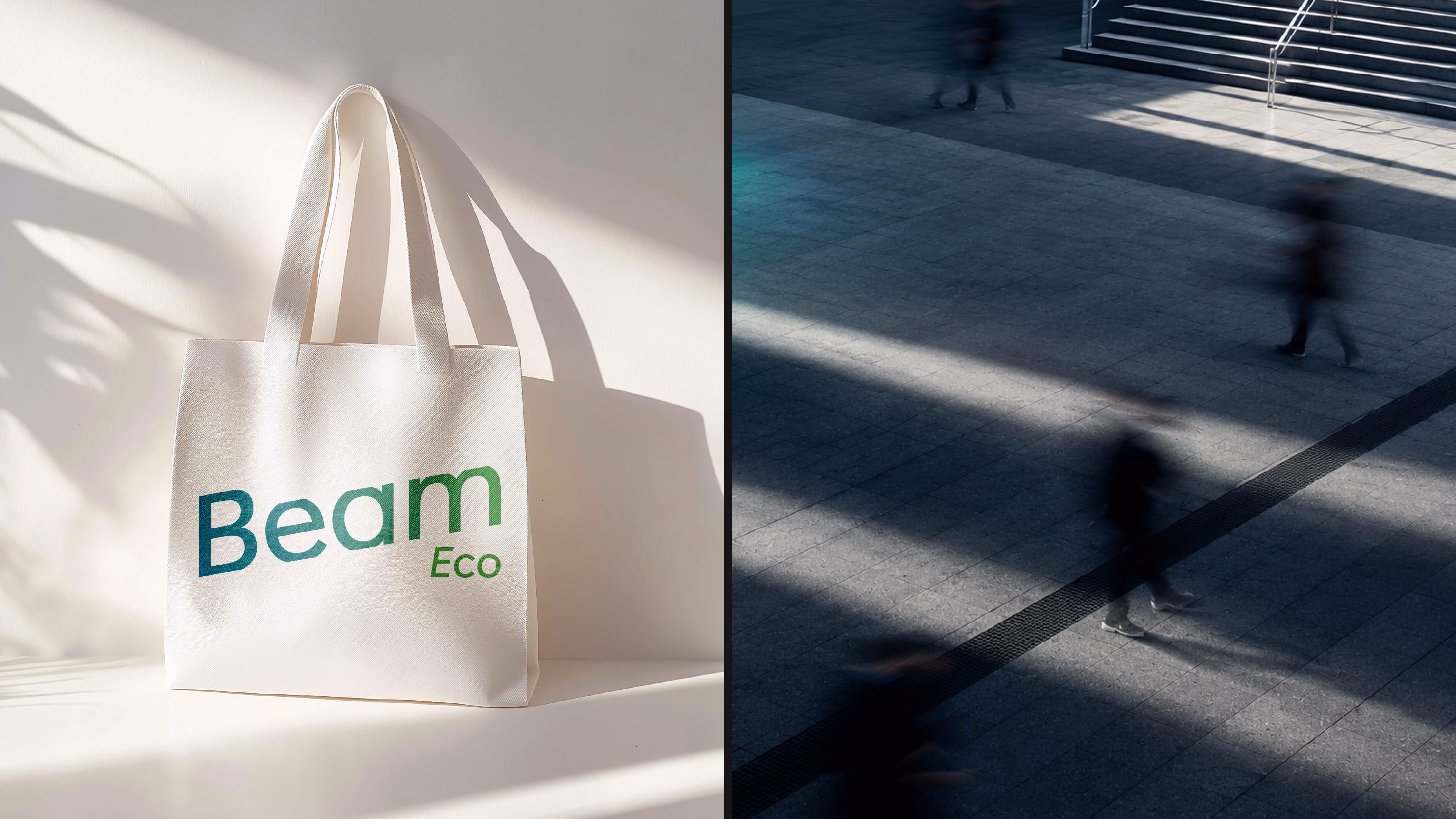
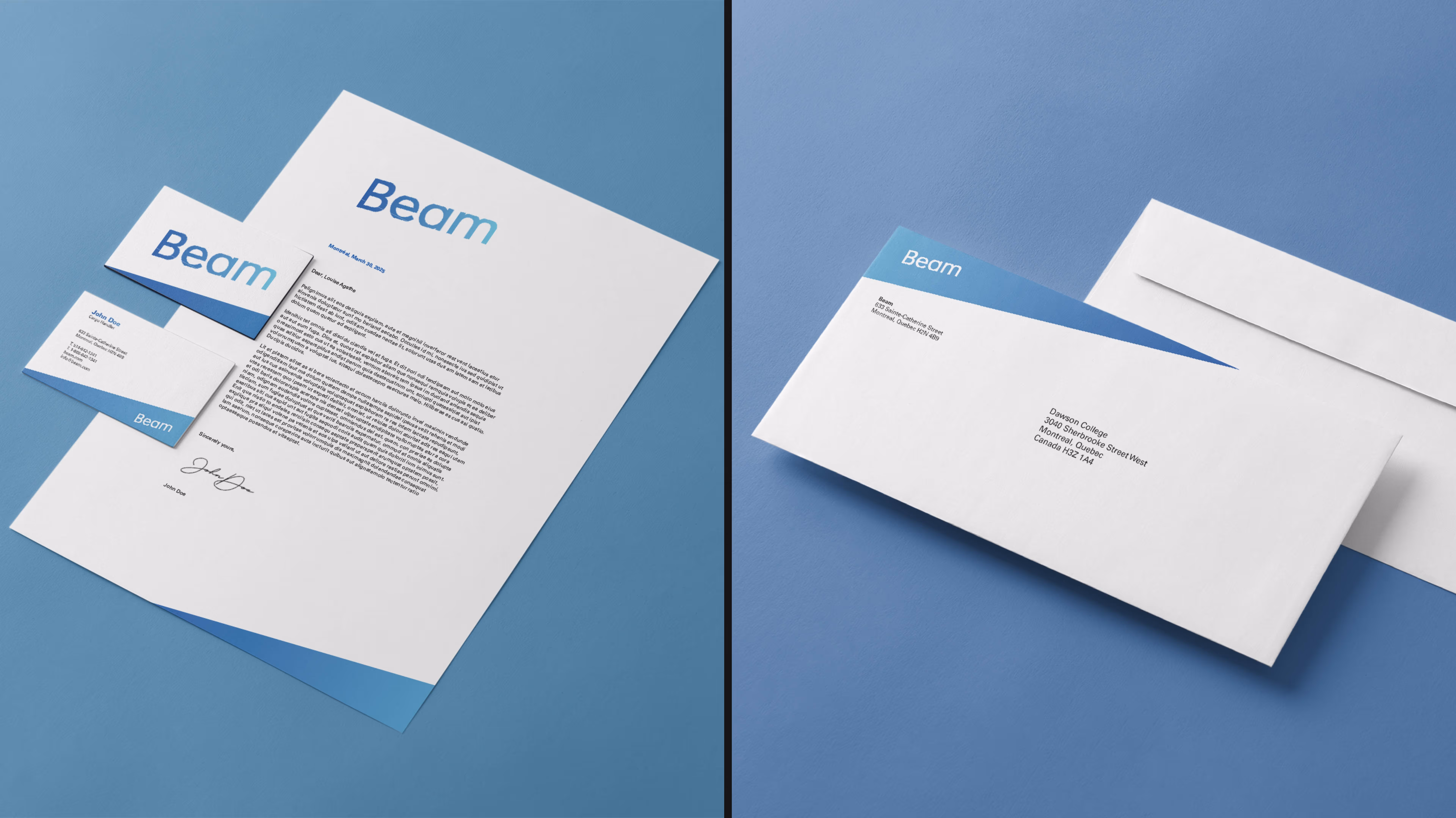
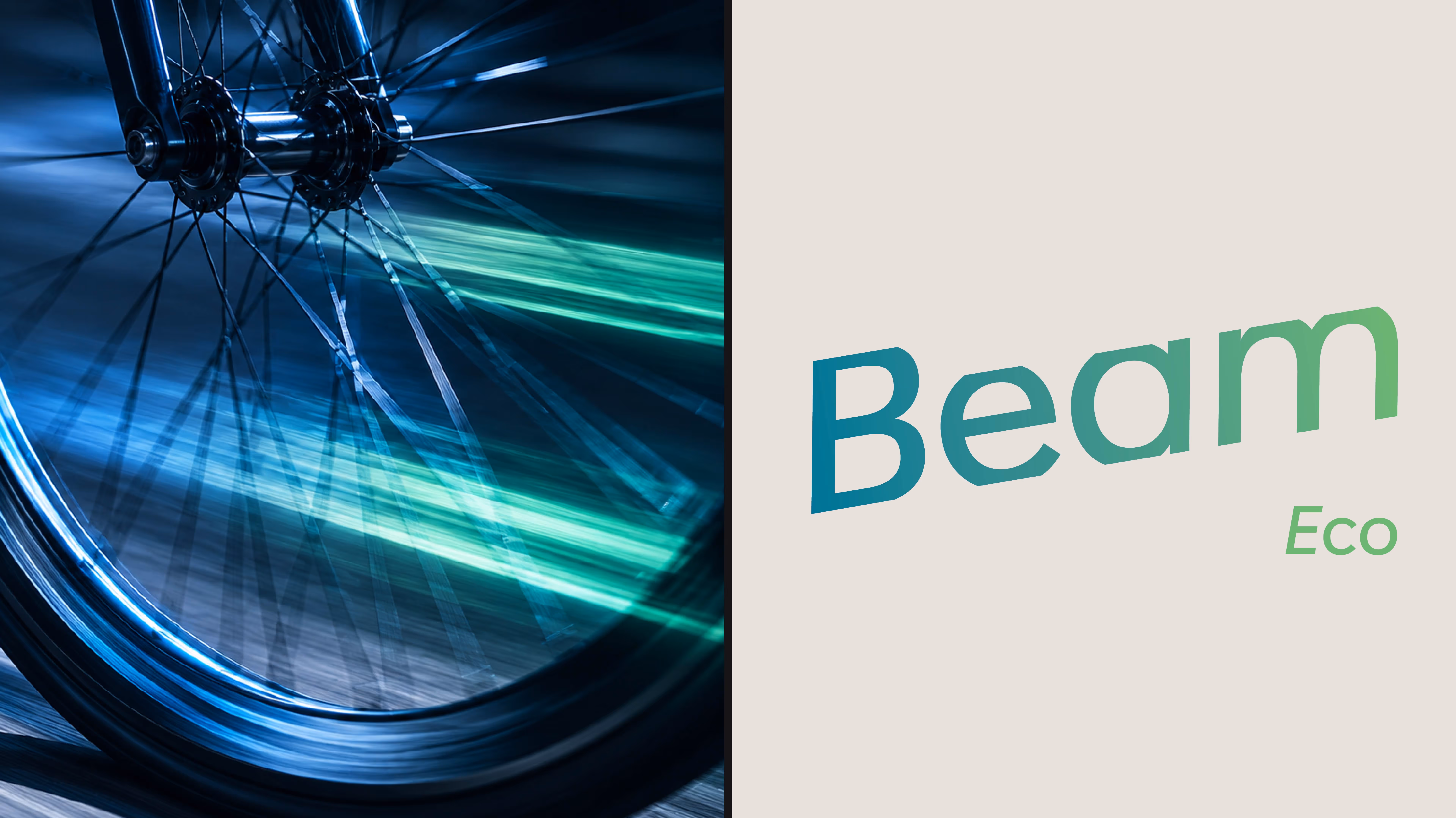
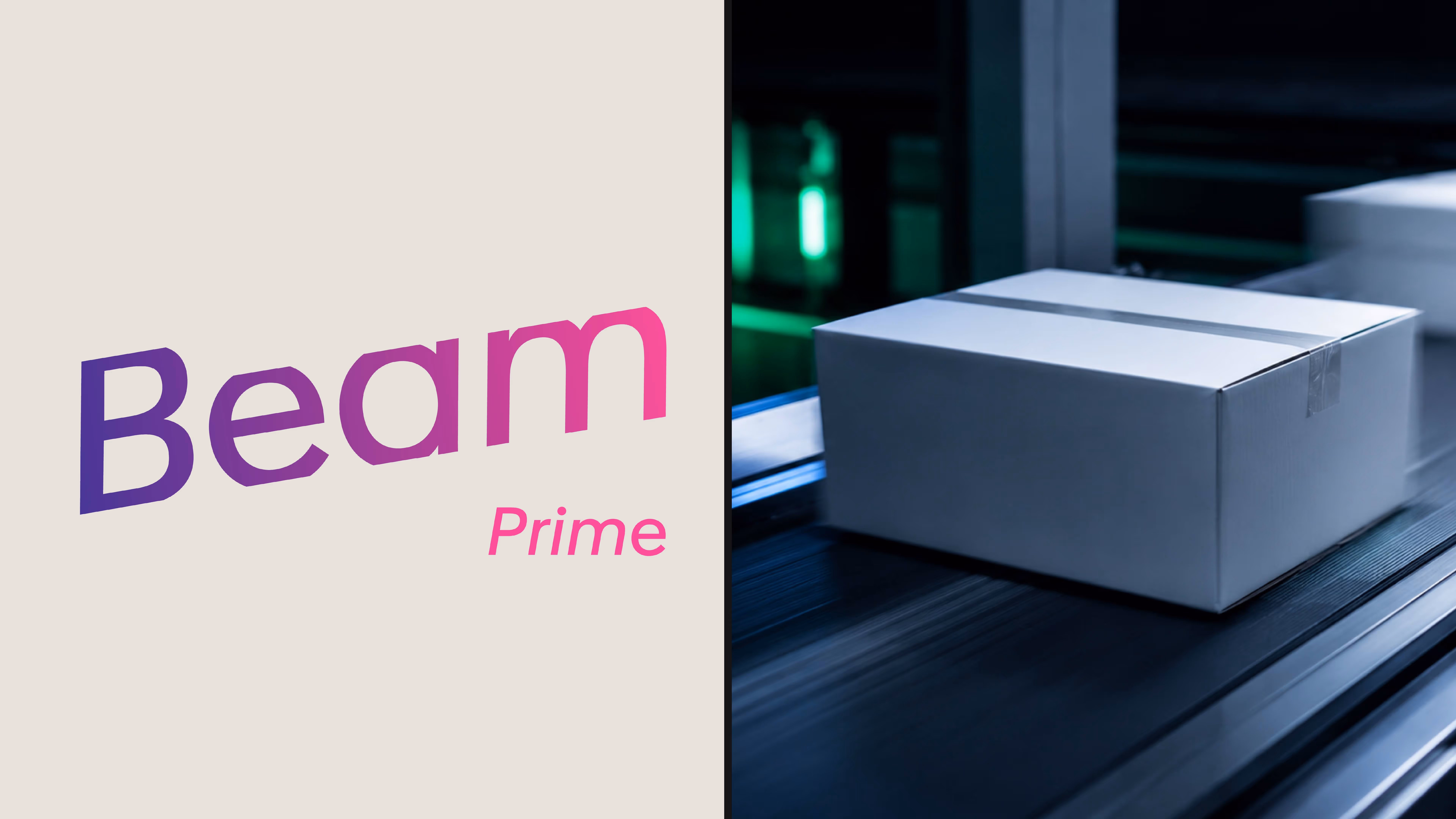
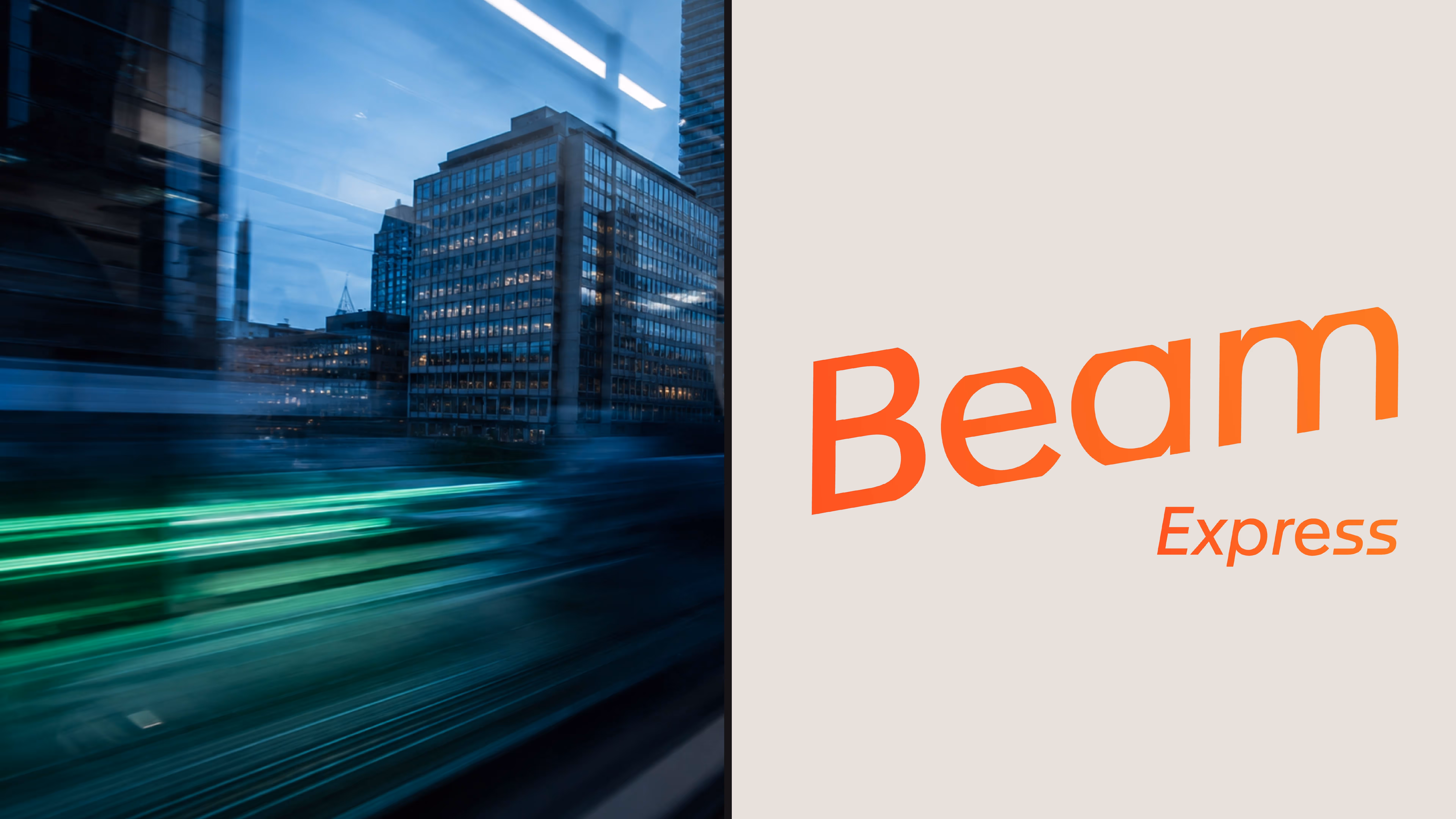
A simple color system helps differentiate service tiers such as Eco, Prime, and Express while keeping the identity consistent. The result is a straightforward typographic mark that feels fast, modern, and easy to recognize across different applications.